Anatomy of an Angry Logo
Logos!
We have logos thrown at us daily, whether while scrolling through our phones or from the grills of cars passing us by on the street. Logos and brand names are everywhere! So when it came to creating a logo for my first comic book, I'll be honest I didn't give it that much thought. I asked the artist working on the Angry Squad to whip something up that looked semi-cool, and the rest would be ok.
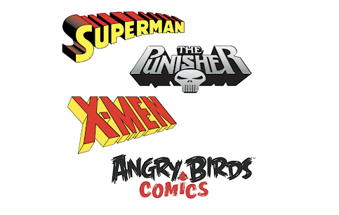
The comic book logo is your story, character and world branding. For instance, look at the Superman logo, The Punisher logo, the X-Men logo, and even the Angry Birds logo. They all speak to the story on offer. They're all on brand.
After researching logos until my eyes bled, I put a brief together and posted a couple of jobs to find a freelance designer on UpWork and Fiverr.
I wanted something slick, sleek, encompassed a team/squad/force, and had big, bold and distinct lines. The colour palette was either red, yellow, or blue. I was hoping for a design that could suit a chrome hood ornament for an old collectible car. My reasoning behind these specifics is that the Angry Squad is a team of unusual individuals. They're big and brash people and are led by a guy who was a relic of the past. Back in his heyday, Angry Fred was a highly sought-after go-to guy (kind of like a shiny chrome Cadillac!) Plus, when you think of teams in pop culture, logos seems big, bold and signature driven. They evoke a stamp, a badge or an exclusive presence. Just check out the A-Team, Mission Impossible, The Man from U.N.C.L.E., and even James Bond himself! (Although he isn't a team, is he?!)
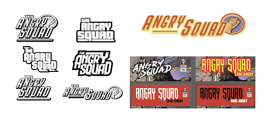
Below are some of the logos the designers submitted for the Angry Squad logo.
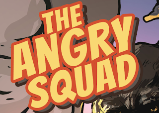
Here's the final logo that I decided on. (Thanks to a few folks on my Instagram page for voting for this logo. Out of 13 comments, 12 liked this one : ) )
DOWNLOAD A FREE COPY OF ANGRY SQUAD: CODE ANGRY
Thanks for reading my blog post!
Until next time let's get angry!
Lucas - Angry Fred Comics


Comments
Post a Comment